
XGBoost Regression
XGBoost (Extreme Gradient Boosting) regression is a powerful machine-learning algorithm that excels at regression tasks. It is an ensemble method that combines the predictions of multiple decision trees to produce a more accurate and robust final prediction. Unlike traditional decision trees, which can be prone to overfitting, XGBoost uses a boosting technique to iteratively build trees. Each new tree attempts to correct the errors of the previous trees, leading to a more accurate overall model.
Furthermore, XGBoost incorporates regularization techniques (L1 and L2) to prevent overfitting and improve generalization to unseen data. It is known for its exceptional performance and is widely used in machine learning competitions and real-world applications due to its ability to handle complex data relationships and provide high prediction accuracy.
This module outlines the following steps:
➤ 1. Import data
➤ 2. Prepare data
➤ 3. Split data
➤ 4. Model training
➤ 5. Prediction
➤ 6. Actual vs. Predicted Graph
➤ 7. Evaluate the model
➤ 8. Predicting Close Price with generated input data
➤ 9. Strengths and Weaknesses
XGBoost Regression
↪ 1. Import data
Import data using read_csv() function.
      import pandas as pd
      import numpy as np
      data = pd.read_csv('https://raw.githubusercontent.com/csxplore/data/main/andromeda-technical.csv',
                       header=0)
      print(data.columns)

      ---Output---
      # Index(['Symbol', 'Series', 'Date', 'Prev Close', 'Open Price', 'High Price',
      #       'Low Price', 'Last Price', 'Close Price', 'Average Price',
      #       'Total Traded Quantity', 'Turnover', 'No. of Trades', 'Deliverable Qty',
      #       '% Dly Qt to Traded Qty', 'SMA20', 'SMA50', 'diff', 'UP'],
      #      dtype='object')
XGBoost Regression
↪ 2. Prepare data
      print(data.shape)

      ---Output---
      # (250, 19)
Choose the required columns for analysis. This exercise predicts the Close Price using the Previous Close Price.
      data2 = data.dropna()
      data2 = data[['Prev Close', 'Close Price']]
      print(data2.head(5))

      ---Output---
      #    Prev Close  Close Price
      # 0     1401.55      1388.95
      # 1     1388.95      1394.85
      # 2     1394.85      1385.10
      # 3     1385.10      1380.30
      # 4     1380.30      1378.45

      X = data[['Prev Close']]
      y = data['Close Price']
XGBoost Regression
↪ 3. Split data
Split the data into training and test sets.
      from sklearn.model_selection import train_test_split
      X_train, X_test, y_train, y_test = train_test_split(X, y, test_size=0.2, random_state=42)
The code above performs a train-test split on a dataset. It utilizes the train_test_split() function to divide the data into training and testing sets. X represents the input features or independent variables, and y represents the corresponding target or dependent variable. The split is performed such that 20% of the data is allocated to the test set (test_size=0.2), while the remaining 80% is used for training. The random_state=42 argument ensures that the split is reproducible.
XGBoost Regression
↪ 4. Model training
The code below initializes and trains an XGBoost regression model using the xgboost library. It begins by
importing the XGBRegressor class, which provides the functionality for XGBoost-based regression. Then, an
XGBRegressor object is instantiated and assigned to the variable xgb. During instantiation, key hyperparameters
are defined as follows.
– n_estimators is set to 100, indicating that the model will use 100 boosting rounds (decision trees)
– learning_rate is set to 0.1, controlling the step size at each round; and
– max_depth is set to 3, limiting the maximum depth of individual decision trees.
These parameters determine the model's learning process and complexity.
Following the model's initialization, the fit() method is called on the xgb object, using X_train as the feature data and y_train as the corresponding target values from the training dataset. In this step, the model learns from the provided training data, iteratively building decision trees and minimizing the error between the predicted values and the actual values.
      from xgboost import XGBRegressor
      xgb = XGBRegressor(n_estimators=100, learning_rate=0.1, max_depth=3)
      xgb.fit(X_train, y_train)
XGBoost Regression
↪ 5. Prediction
The code below uses the trained XGBoost regression model to make predictions on new, unseen data.
      # Make predictions on the test set
      prediction = xgb.predict(X_test)
The code compares the model's predictions to the actual values from the test dataset (y_test). It creates a Pandas DataFrame to display the first 5 'Actual' versus 'Predicted' values, providing a quick visual check of the model's performance on unseen data.
# Compare the actual and predicted values y_pred = pd.DataFrame(prediction, columns=['Pred']) dframe = pd.concat([y_test.reset_index(drop=True).astype(float),y_pred], axis=1) dframe.columns = ['Actual','Predicted'] graph = dframe.head(5) print(graph)
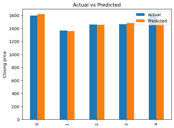
---Output--- # Actual Predicted # 0 1597.65 1617.206421 # 1 1367.40 1355.175781 # 2 1458.65 1454.996948 # 3 1464.85 1481.486328 # 4 1611.15 1507.974976
The code below demonstrates how to use a trained XGBoost regression model to predict an outcome for a new, unseen data point.
      from numpy import asarray
      Predict_Close_Price= xgb.predict(asarray([1508.80]))
      print("Predicted Value: ", Predict_Close_Price)
      # Predicted Value:

      ---Output---
      # Predicted Value: [1507.975]
XGBoost Regression
↪ 6. Actual vs. Predicted Graph
Bar chartThe code below generates a bar chart that compares actual and predicted values. It uses the matplotlib.pyplot library to create a bar plot from the DataFrame “graph”.
      import matplotlib.pyplot as plt
      graph.plot(kind='bar')
      plt.title('Actual vs Predicted')
      plt.ylabel('Closing price')
      plt.show()
XGBoost Regression
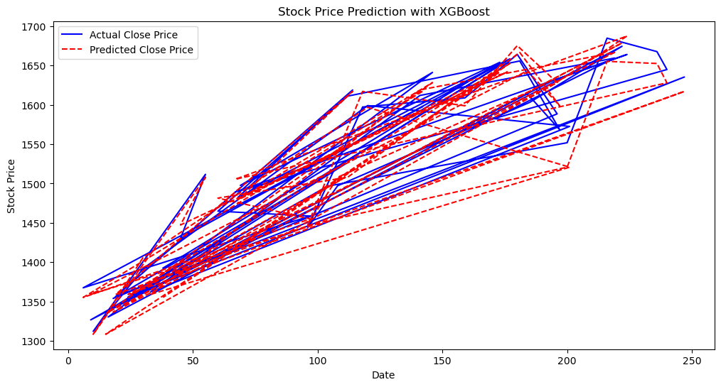
↪ 6. Actual vs. Predicted Graph
Line chartThe code below produces a visualization image of stock price predictions using two lines on the same graph : one representing the “Actual Close Price” using the y_test data, shown in blue, and another representing the “Predicted Close Price” using the prediction data, shown in red with a dashed line style.
      # Visualize the predicted vs. actual stock prices
      plt.figure(figsize=(12, 6))
      plt.plot(y_test.index, y_test.values, label='Actual Close Price', color='blue')
      plt.plot(y_test.index, prediction, label='Predicted Close Price', color='red', linestyle='dashed')
      plt.title('Stock Price Prediction with XGBoost')
      plt.xlabel('Date')
      plt.ylabel('Stock Price')
      plt.legend()
      plt.show()
XGBoost Regression
↪ 7. Evaluate the model
This code evaluates the performance of a regression model using two key metrics: Mean Squared Error (MSE) and R-squared (R²). The mean_squared_error function computes the average squared difference between the model's predictions (y_pred) and the true values (y_test). A lower MSE indicates better accuracy.
      from sklearn.metrics import mean_squared_error
      mse = mean_squared_error(y_test, y_pred)
      print(f"Mean Squared Error: {mse}")

      ---Output---
      # Mean Squared Error: 588.6288800881035
The MSE, which is 588.62, represents the average squared difference between the model's predictions and the actual values in the test set. A lower MSE is better, indicating that the model's predictions are, on average, close to the true values.
The r2_score function calculates the R-squared, a measure of how well the model fits the data, ranging from 0 to 1. A higher R² (closer to 1) suggests a better fit, indicating that the model explains a larger proportion of the variance in the dependent variable.
      from sklearn.metrics import  r2_score
      r2 = r2_score(y_test, y_pred)
      print(f"R-squared: {r2}")

      ---Output---
      # R-squared: 0.958235319285963
The R-squared value of 0.958 indicates that the model explains approximately 95.8% of the variance in the data. This is a high R-squared, suggesting a good model fit to the test data.
XGBoost Regression
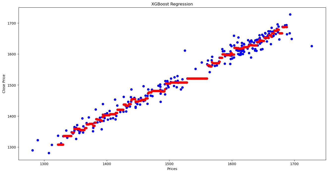
↪ 8. Predicting Close Price with generated input data
Create input data in the x_test range in the interval of 1, and predict the Close Price for each generated input data.
      X_grid = np.arange(X_test.values.min(), X_test.values.max())
      # Reshape the data into  a len(X_grid)*1 array, i.e. to make a column out of the X_grid values
      X_grid = X_grid.reshape((len(X_grid), 1))
      # Compare the predicted Close Price with the actual Close Price using scatter plot.
      plt.figure(figsize=(16,8))
      plt.title('XGBoost Regression')
      plt.xlabel('Prices')
      plt.ylabel('Close Price')
      plt.scatter(X, y, color = "blue")
      plt.scatter(X_grid, xgb.predict(X_grid), color = 'red')
      plt.show()
XGBoost Regression
↪ 9. Strengths and Weaknesses
Strengths
Weaknesses