
Data Visualization – plot() function
This section will show how to visualize the data using the plot() function. Each example shows a specific task that demonstrates how to visualize the data.Topics covered in this section are
➤ Basic Plot
➤ Plot Types
➤ Plot Arguments
➤ Global Graphics Parameters
➤ Aesthetics
➤ Annotation Functions
Data Visualization – plot() function
↪ Basic Plot: Data Frame Used
The data frame used for visualizing the data through various charts is below.
      stock <- read.csv('https://raw.githubusercontent.com/csxplore/data/main/stock-plot.csv', header=T)
      stock10 <- stock[1:10,]
      stock10

      ---Output---
      -       Date   Close  Volume No.of.trades
      1  27-Feb-23 1083.95 1834553        74276
      2  24-Feb-23 1094.85 1684570        50674
      3  23-Feb-23 1094.35 2139983        77977
      4  22-Feb-23 1092.60 2212194       118301
      5  21-Feb-23 1105.20 1313278        61305
      6  20-Feb-23 1115.70 1706036        68229
      7  17-Feb-23 1109.55 1958807        72982
      8  16-Feb-23 1128.15 2369355       111635
      9  15-Feb-23 1132.90 1648954        50296
      10 14-Feb-23 1125.45 3938046        93554
Data Visualization – plot() function
↪ Basic Plot: plot() function
The plot() function is a basic plotting function from the graphics package.
plot(stock10) # draws scatterplot matrix
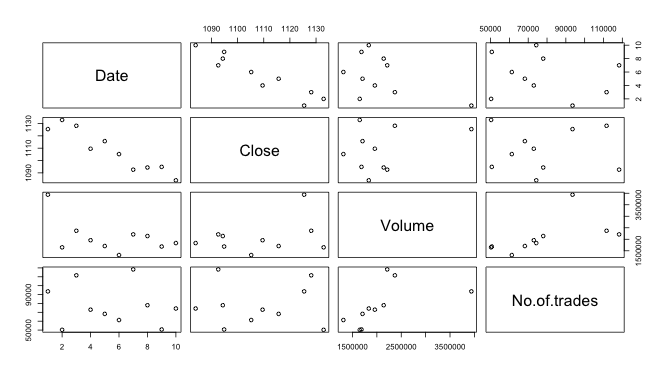
The plot() function draws a scatter, line, histogram, or other basic plots depending on the type argument. Calling plot() draws a plot on the screen device. The basic syntax of the plot() function is below.
      plot(dataframe)           # A data frame is passed
      plot(x, y, ...)           # x and y coordinate vectors are passed
The character variables should be removed before passing the data frame to the plot() function.
Data Visualization – plot() function
↪ Basic Plot: Scatter Plot with two variables
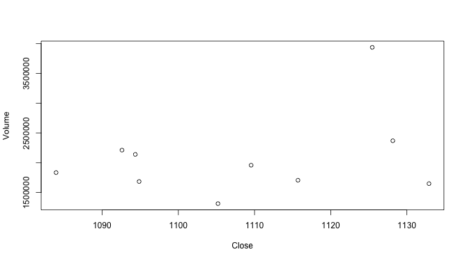
Numerical columns from the frame can be passed as arguments to the plot() function.
plot(stock10[,2:3]) # draws scatter plot with the variables column 2 and 3
Data Visualization – plot() function
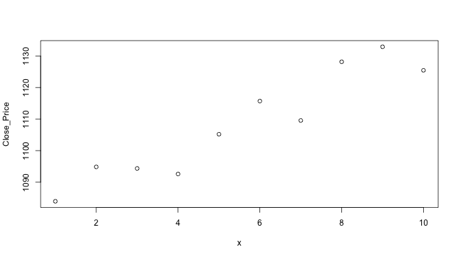
↪ Basic Plot: x coordinate
      Close_Price <- stock10$Close
      x <- c(1,2,3,4,5,6,7,8,9,10)
      plot(x, Close_Price)
Data Visualization - plot() function
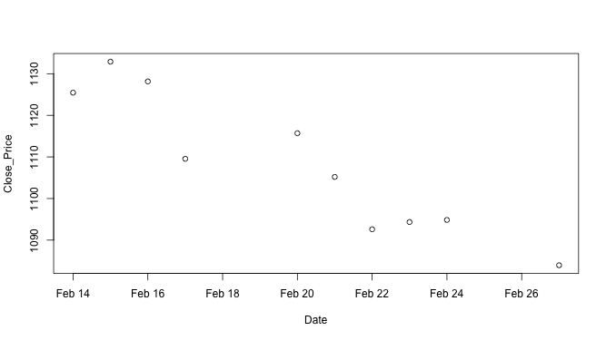
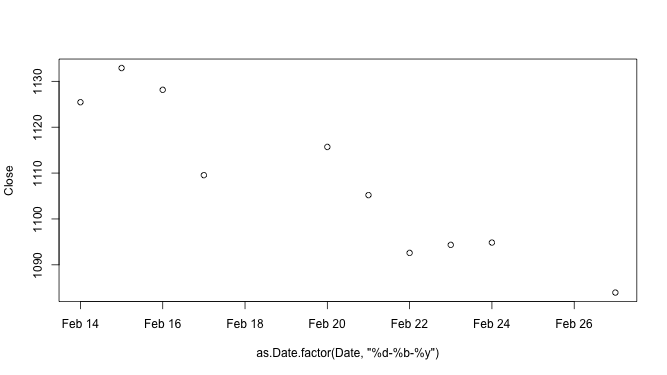
↪ Basic Plot: Date Axis
The below example shows the plot where the x coordinate is a Date factor.
      Close_Price <- stock10$Close
      Date <- as.Date.factor(stock10$Date, "%d-%b-%y")
      plot(Date, Close_Price)
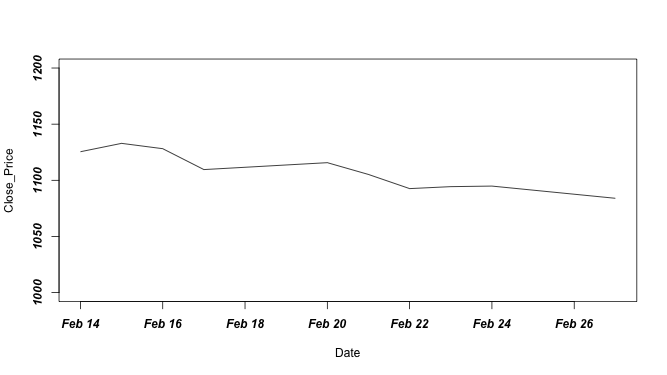
Data Visualization - plot() function
↪ Basic Plot: with() function
The with() function can also be used. The with() function evaluate an Expression in a Data Environment.
with(stock10, plot(as.Date.factor(Date, "%d-%b-%y"),Close))
Data Visualization - plot() function
↪ Plot Types
The type argument tells what plot type should be drawn. Possible types are
Data Visualization - plot() function
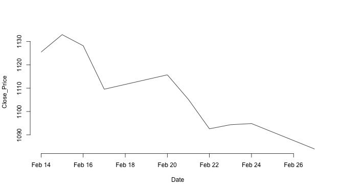
↪ Line Chart
The type = "l" argument instructs plot() function to draw a line chart.
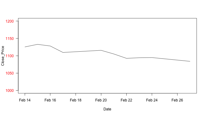
      Close_Price <- stock10$Close
      Date <- as.Date.factor(stock10$Date, "%d-%b-%y")
      plot(Date, Close_Price, type = "l")  # Note: type = "l"

Data Visualization - plot() function
↪ Plot Arguments
Besides x and y coordinates and type arguments, plot() function accepts several graphical parameters. See Global Graphics Parameters section.
For example, an argument frame.plot = FALSE to the plot() function removes the box around the plot.
      Close_Price <- stock10$Close
      Date <- as.Date.factor(stock10$Date, "%d-%b-%y")
      plot(Date, Close_Price, type = "l", frame.plot = FALSE) # Note: frame.plot = FALSE
Arguments of the plot() function are listed below.
Data Visualization - plot() function
↪ Global Graphics Parameters
The par() function is used to set or specify the global graphics parameters that affect all plots in an R session. However, These parameters can be overridden when they are specified as arguments to specific plot() functions.
Data Visualization - plot() function
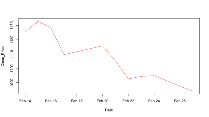
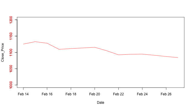
↪ Global Graphics Parameters
For example, col = "red" argument changes plotting color to red.
      Close_Price <- stock10$Close
      Date <- as.Date.factor(stock10$Date, "%d-%b-%y")
      plot(Date, Close_Price, type = "l", col = "red")  # Note: col = "red"

Data Visualization - plot() function
↪ Aesthetics: Titles
Add the chart title using main, and add the axis title using xlab, and ylab arguments as shown below.
      Close_Price <- stock10$Close
      Date <- as.Date.factor(stock10$Date, "%d-%b-%y")
      plot(Date, Close_Price, ylim=c(1000,1200), type="l", pch=20,
           main="Stock Trend", xlab="Date", ylab="Close",   # Note: main, xlab, and ylab
           col.lab = "red", col.main = "red")

Data Visualization - plot() function
↪ Aesthetics: Background
Add background color to the plot using the par() function.
      Close_Price <- stock10$Close
      Date <- as.Date.factor(stock10$Date, "%d-%b-%y")
      par( bg = "grey")                    # Note: par() function
      plot(Date, Close_Price, type = "l", col = "red")
Data Visualization - plot() function
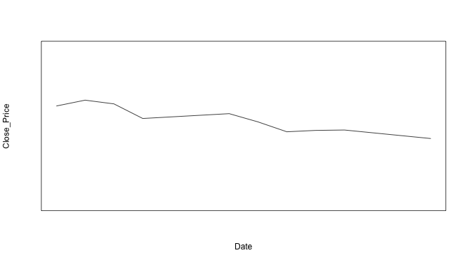
↪ Aesthetics: Suppressing the axis labels
Suppressing plotting of the axis using xaxt and yaxt arguments.
      Close_Price <- stock10$Close
      Date <- as.Date.factor(stock10$Date, "%d-%b-%y")
      plot(Date,Close_Price, ylim=c(1000,1200), type="l",
           pch=20, yaxt = "n", xaxt = "n" )              # Note: xaxt and yaxt
Data Visualization - plot() function
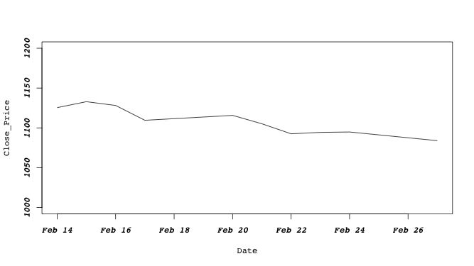
↪ Aesthetics: Fonts
The font argument is an integer that specifies which font to use for text.
      Close_Price <- stock10$Close
      Date <- as.Date.factor(stock10$Date, "%d-%b-%y")
      plot(Date,Close_Price, ylim=c(1000,1200), type="l",
           pch=20, font=4)     # Note: font=4, display the text in bold italic
Data Visualization - plot() function
↪ Aesthetics: Fonts Family
The family argument is a name of a font family for drawing text.
      Close_Price <- stock10$Close
      Date <- as.Date.factor(stock10$Date, "%d-%b-%y")
      plot(Date,Close_Price, ylim=c(1000,1200), type="l",
           pch=20, font=4, family="mono")      # Note: family="mono"
Data Visualization - plot() function
↪ Annotation functions
Annotation functions are called to add to the already-made plot.
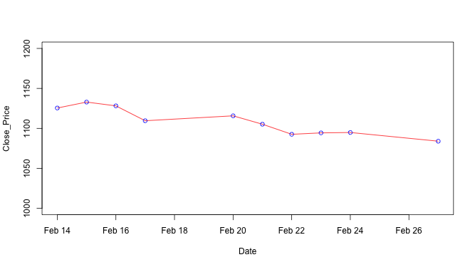
Data Visualization - plot() function
↪ Adding points
The points() is a generic function to draw a sequence of points at the specified coordinates.
      plot(Date, Close_Price, type = "l", ylim=c(1000,1200), col = "red")
      points(Date, Close_Price,  col = "blue")
Data Visualization - plot() function
↪ Adding axis
The axis() function adds an axis to the current plot, allowing the specification of the side, position, labels, and other options.
Setting of ylim to change the y axis scaling.
      plot(Date, Close_Price, type = "l", ylim=c(1000,1200), col = "red")
      axis(2, col.axis = "red")    # Set y axis color to Red
Changing axis labels direction using las graphical parameter.
      plot(Date,Close_Price, ylim=c(1000,1200), type="l",  pch=20, yaxt = "n" )
      axis(2, las=1,col.axis = "red")   # Note: las=1 flips y label horizontally
Data Visualization - plot() function
↪ Legends
The legend() function adds legends to plots.
Adding legends
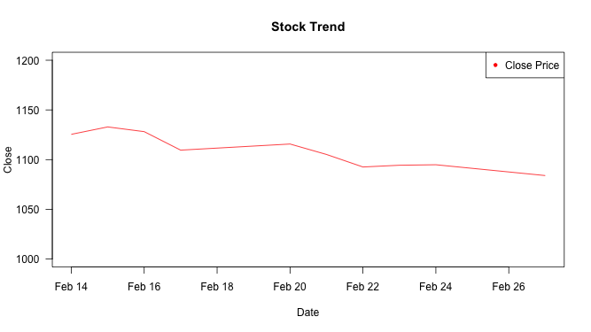
      plot(Date, Close_Price, ylim=c(1000,1200), type="l", las=1, pch=20,
           main="Stock Trend", xlab="Date", ylab="Close", col = "red")
      legend("topright", "Close Price", pch = 20, col = "red")
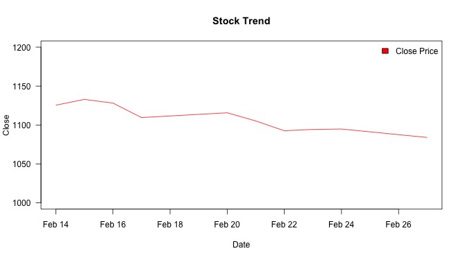
Removing the legend border
An argument bty = "n" to legend() function removes the border to legend.
      plot(Date, Close_Price, ylim=c(1000,1200), type="l", las=1, pch=20,
           main="Stock Trend", xlab="Date", ylab="Close", col = "red")
      legend("topright", "Close Price",  fill = "red", bty = "n")
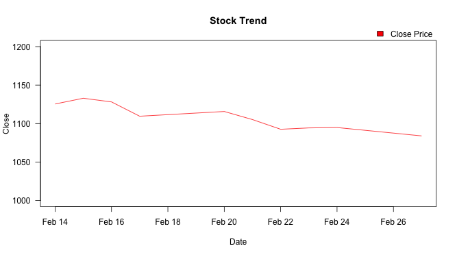
Adding the legend outside the plot area
To do this, par(xpd=TRUE) needs to be set to enable text to be drawn outside the plot region. The inset(x, y) argument controls the location of the legend.
      par(xpd = TRUE)
      plot(Date, Close_Price, ylim=c(1000,1200), type="l", las=1, pch=20,
           main="Stock Trend", xlab="Date", ylab="Close", col = "red")
      legend("topright", "Close Price",  fill = "red", bty = "n",inset = c(0,-0.1))
Data Visualization - plot() function
↪ Line segments
The lines() is a generic function taking given coordinates and joining the corresponding points with line segments.
Adding line segments
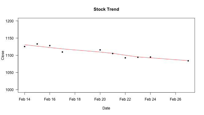
      plot(Date, Close_Price, ylim=c(1000,1200), type="p", las=1, pch=20,
           main="Stock Trend", xlab="Date", ylab="Close")
      lines(Date, Close_Price, col = "red")

LOWESS smoother
Above lines function connects dots on the scatter plot. The stats::lowess() function performs the computations for the LOWESS (Locally Weighted Scatterplot Smoothing) smoother which uses locally-weighted polynomial regression or moving regression.
      plot(Date, Close_Price, ylim=c(1000,1200), type="p", las=1, pch=20,
           main="Stock Trend", xlab="Date", ylab="Close")
      lines(stats::lowess(Date, Close_Price), col = "red")
Data Visualization - plot() function
↪ Plot Text
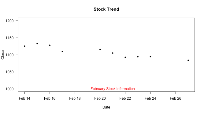
The text() function draws the strings given in the vector labels at the coordinates x and y.
      plot(Date, Close_Price, ylim=c(1000,1200), type="p", las=1, pch=20,
           main="Stock Trend", xlab="Date", ylab="Close")
      text(Date[5],1000, labels = "February Stock Information", col = "red")
Data Visualization - plot() function
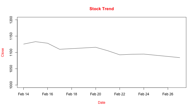
↪ Plot Titles
The title() function can be used for adding the main title, sub-title, x axis label, y axis label, and other graphical parameters.
Recap that the plot arguments main, xlab, and ylab used for adding title, x axis title, and y axis title.
      plot(Date, Close_Price, ylim=c(1000,1200), type="l", pch=20,
           main="Stock Trend", xlab="Date", ylab="Close",
           col.lab = "red", col.main = "red")
The above plot can be rewritten separating title() from the plot()
      plot(Date, Close_Price, ylim=c(1000,1200), type="l", pch=20, xlab = "", ylab = "")
      title(main="Stock Trend", xlab="Date", ylab="Close",
            col.lab = "red", col.main = "red")
Data Visualization - plot() function
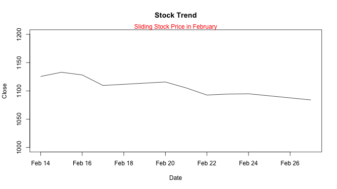
↪ Writing text into the margins of a plot
The mtext() function allows adding arbitrary text in the plot. The text is written in one of the four margins of the current figure region or one of the outer margins of the device region.
      plot(Date, Close_Price, ylim=c(1000,1200), type="l", pch=20, xlab = "", ylab = "")
      title(main="Stock Trend", xlab="Date", ylab="Close")
      mtext("Sliding Stock Price in February", side = 3, col = "red")  # side = 3 prints text at top
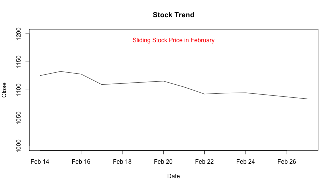
The line argument allows the text to be printed inside the frame.
      plot(Date, Close_Price, ylim=c(1000,1200), type="l", pch=20, xlab = "", ylab = "")
      title(main="Stock Trend", xlab="Date", ylab="Close")
      mtext("Sliding Stock Price in February", side = 3, col = "red", line = -2)  # Note: line = -2
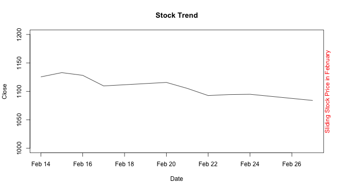
The argument side = 4 to line() function prints text on the right margin.
      plot(Date, Close_Price, ylim=c(1000,1200), type="l", pch=20, xlab = "", ylab = "")
      title(main="Stock Trend", xlab="Date", ylab="Close")
      mtext("Sliding Stock Price in February", side = 4, col = "red")  # Note: side = 4
Data Visualization - plot() function
↪ Summary