Simple Linear Regression
Linear regression is a supervised machine learning algorithm used for predictive analysis. The Linear Regression algorithm predicts the value of a variable y based on the value of one or more quantitative variable x = (x1, x2, … xn), where y is a dependent (or outcome) variable and x is an independent (or predictor or explanatory) variables.
Simple Linear Regression is a commonly considered analysis method when examining the relationship between a quantitative outcome y and a single quantitative independent variable x.
The structural model underlying a simple linear regression analysis is that the independent variable x and outcome variable y are linearly related such that the population mean of the outcome for any x value is ax + b. It is represented as
      ---Output---
      #     E(y|x) = ax + b
      # where
      #     E(), “expected value of”
      #     y|x, “y given x”,indicates the possible values of y when x is restricted to some single value
      #     a, slope parameter
      #     b, intercept parameter
The slope represents the change in the dependent variable for a unit change in the independent variable. The intercept is the value of the dependent variable when the independent variable is zero.
The goal of Linear Regression is to find the best-fitting line that minimizes the difference between predicted and actual values.
Simple Linear Regression
This module covers the following steps:
➤ 1. Import the required libraries
➤ 2. Read the data for Linear Regression analysis
➤ 3. Understanding the data
➤ 4. Split the data into train and test sets
Simple Linear Regression
↪ 1. Import the required libraries
Pandas is a Python library that is used to work with data sets. When working with tabular data, such as data stored in spreadsheets or databases, pandas give the APIs to explore, clean, and process the data. In Pandas, a data table is called a DataFrame. Reference: https://pandas.pydata.org/
Matplotlib is a Python library for creating static, animated, and interactive visualizations in Python. The pyplot submodule contains most of the Matplotlib utilities. Reference: https://matplotlib.org/
Seaborn is a Python data visualization library based on matplotlib. It provides a high-level interface for drawing attractive and informative statistical graphics. It provides data visualizations that are more aesthetic, statistically sophisticated, and offer more appealing default color palettes. Reference: https://seaborn.pydata.org/
Scikit-learn (sklearn) is a machine-learning Python library that supports supervised and unsupervised learning. The sklearn provides statistical tools for data preprocessing, model design, and analysis. Reference: https://scikit-learn.org/stable/
Statsmodels is a Python module that provides classes and functions for the estimation of many different statistical models, as well as for conducting statistical tests, and statistical data exploration. Reference: https://www.statsmodels.org/stable/api.html
      import pandas as pd                                 # Matplotlib is the fundamental plotting library
      import matplotlib.pyplot as plt                     # Seaborn builds upon Matplotlib, offering a
      import seaborn as sns                               # higher-level interface for statistical visualization.
Set default style and color scheme for Seaborn plots.
sns.set(style="ticks", color_codes=True)
Simple Linear Regression
↪ 2. Read the data for Linear Regression analysis
The read_csv() method of the Pandas library can be used to read a CSV file.
      data = pd.read_csv('https://raw.githubusercontent.com/csxplore/data/main/andromeda-cleaned.csv',
                       header=0)
The objective of this module is to demonstrate simple linear regression to predict “Close Price” of the stock from the previous day's close price. That is to say, “Close Price” is the dependent variable, and “Prev Close” is the independent variable.
So, select just the relevant columns below for further analysis.
      data = data[['Prev Close','Close Price']]
      print(data.head(5))

      ---Output---
      # -   Prev Close  Close Price
      # 0     1401.55      1388.95
      # 1     1388.95      1394.85
      # 2     1394.85      1385.10
      # 3     1385.10      1380.30
      # 4     1380.30      1378.45
Simple Linear Regression
↪ 3. Understanding the data
The data should exhibit the following characteristics for successful regression analysis and model building.
If these assumptions are not met, linear regression analysis may produce misleading results, potentially creating a false sense of relationship in the data even when none exists.
Simple Linear Regression
↪ 3. Understanding the data
i.a. Finding outliers using IQR
The describe() method of Pandas DataFrame returns a description of the data in the DataFrame.print(data.describe(include = 'all')) #parameter include=all will display NaN values as well
---Output--- # - Prev Close Close Price # count 250.000000 250.000000 # mean 1536.385800 1537.268600 # std 112.143024 111.947898 # min 1281.300000 1281.300000 # 25% 1439.100000 1440.512500 # 50% 1579.825000 1582.325000 # 75% 1631.087500 1631.087500 # max 1727.800000 1727.800000
The result’s index includes count, mean, std, min, percentiles, and max values. The data set has 250 observations.
By default, the lower percentile or first quartile is 25 and the upper percentile or third quartile is 75. Q1 and Q3 represent the first and third quartiles, respectively.
The 50 percentile is the same as the median.
      # IQR is the Interquartile Range (IQR = Q3 - Q1), which is
      #     IQR for Prev Close  = 1631 - 1439 = 192
      #     IQR for Close Price = 1631 - 1440 = 191
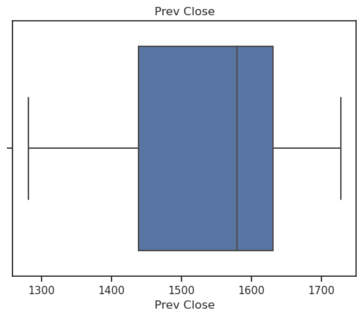
Values above Q3 + (1.5 x IQR) or below Q1 – (1.5 x IQR) are considered as outliers.
      #     For Prev Close: min = 1281, max = 1727
      #         Q3 + (1.5 x IQR) = 1631 + (1.5 x 192)
      #                          = 1919, which is greater than max ie. no outliers at the upper bound
      #
      #         Q1 - (1.5 x IQR) = 1281 - (1.5 x 192)
      #                          = 993, which is less than min ie. no outliers at the lower bound
      #
      #     For Close Price: min = 1281, max = 1727
      #         Q3 + (1.5 x IQR) = 1631 + (1.5 x 191)
      #                          = 1917.5, which is greater than max ie. no outliers at the upper bound
      #
      #         Q1 - (1.5 x IQR) = 1281 - (1.5 x 191)
      #                          = 994.5, which is less than min ie. no outliers at the lower bound
Values above Q3 + (3 x IQR) or below Q1 – (3 x IQR) are considered extreme points (or extreme outliers). In the data set, no outliers or extreme outliers are found.
Simple Linear Regression
↪ 3. Understanding the data
i.b. Finding outliers using Boxplots
Boxplots are a popular and easy method for identifying outliers. The boxplot is an effective tool to visualize the data spread with respect to central values, and it shows the min, max, median, first quartile, and third quartile.vars = ['Prev Close', 'Close Price'] for v in vars: sns.boxplot(x=v, data=data) plt.title(v) plt.show()


Simple Linear Regression
↪ 3. Understanding the data
ii. Linear Relationship
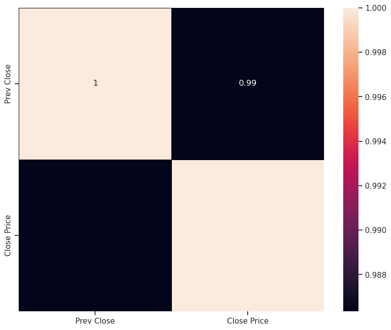
A correlation analysis in linear regression models provides information on the strength and direction of the linear relationship between the dependent and independent variables.Correlation heatmaps are a type of plot that visualizes the strength of relationships between numerical variables.
      corr = data.corr()
      sns.heatmap(corr, vmin=None, vmax=None, cmap=None,
                  center=None, annot_kws= None, linewidths=0.5,
                  linecolor = 'black', cbar=True, annot=True)
      plt.show()

A correlation coefficient provides a measure of the strength of linear association – a measure of how closely the individual data points lie on the regression line.
The value of the correlation coefficient can take any value from -1 to 1.
The correlation coefficient of 0.99 between “Prev Close” and “Close Price” indicates a strong linear relationship between them.
Simple Linear Regression
↪ 3. Understanding the data
iii. Independence
The data set is a record of the closing price of a stock where the price information of the same stock was collected over time. This type of dataset is called a Longitudinal dataset, and this type of dataset must pass the independence test.⚠ HOTS
There are two types of data studies: Cross-sectional and Longitudinal.
A residual time series plot (residuals vs. fitted line) or plot of residual autocorrelations will help to confirm the independence of observations. This test will be covered in the later section.
Scatter plots are a powerful tool for visually assessing data independence, and they can help identify patterns, clusters, outliers, and potential relationships between variables.
The regplot() method in the seaborn package is used to draw a scatter plot and a linear regression model fit. This helps to emphasize patterns in a dataset. The plot below shows the resulting regression line of x and y and a 95% confidence interval for that regression.
      x=data[['Prev Close']]
      y=data[['Close Price']]
      sns.regplot(x=x, y=y, ci=90,
                  scatter_kws = {"color": "black", "alpha": 0.5},
                  line_kws = {"color": "red"})
      plt.show()

Remember that, it's essential to consider other statistical methods and context to understand fully the nature of the relationship between variables.
While the seaborn package makes exploring a dataset through visualization quick and easy, the statsmodels should be used to obtain quantitative measures related to the fit of regression models. The regplot() method in the seaborn is primarily intended to add a visual guide that helps to emphasize patterns in a dataset during exploratory data analyses.
Simple Linear Regression
↪ 4. Split the data into train and test sets
Supervised machine learning is about creating models that precisely map the given inputs (explanatory, predictors, independent variables) to the given outputs (responses, dependent variables).
The train test split is a model validation procedure that allows the machine to simulate how a model would perform on new or unseen data. A goal of supervised learning is to build a model that performs well on new data.
The train_test_split() method is used to split the data into train and test sets.
      from sklearn.model_selection import train_test_split
      x_train, x_test, y_train, y_test = train_test_split(x,y, test_size=0.2,random_state=0)
The dataframe is divided into x_train, x_test, y_train, and y_test. The x_train and y_train sets are used for training and fitting the model. The x_test and y_test sets are used for testing the model. The train sets should be larger than the test sets.
      print("x_train.shape: ", x_train.shape )
      print("x_test.shape: ", x_test.shape )
      print("y_train.shape: ", y_train.shape )
      print("y_test.shape", y_test.shape )

      ---Output---
      # x_train.shape:  (200, 1)
      # x_test.shape:  (50, 1)
      # y_train.shape:  (200, 1)
      # y_test.shape (50, 1)
